Graphic Design is the creative process of combining text, images, and other visual elements to create a visual representation of a message or idea.
The purpose of graphic design is to communicate a message or idea in an effective and visually appealing way.
Graphic designers use a combination of typography, color theory, visual hierarchy, and composition to create designs for various mediums s
such as print, web, and digital media. Graphic design is used in various industries such as advertising, branding, marketing, and publishing.
The design process typically involves research, conceptualization, sketching, digital design, and finalizing the design for production.
A successful graphic design should be both visually appealing and functional in effectively conveying its intended message to its target audience.
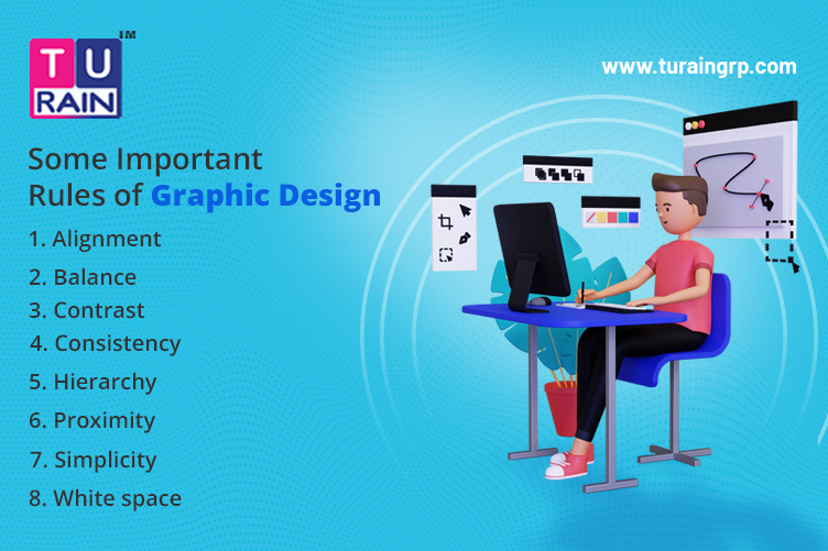
Here are some important rules of graphic design:
- Simplicity: Keep it simple and clear. Your design should be easy to understand and not cluttered.
- Balance: Achieving visual balance is important in graphic design. Balance can be achieved by using symmetry or asymmetry.
- Contrast: Contrast helps to make elements stand out from each other. Use contrast to create visual interest and hierarchy.
- Alignment: Alignment creates a sense of order and makes the design more visually appealing. Make sure all elements are aligned to create a cohesive design.
- Hierarchy: Use hierarchy to guide the viewer’s eye through the design. This can be achieved by varying the size, color, and position of elements.
- Proximity: Elements that are related should be grouped together to create a visual relationship.
- Consistency: Consistency creates a sense of unity and professionalism. Use consistent fonts, colors, and spacing throughout the design.
- White space: Don’t be afraid of white space. It can help to create a clean and modern design and also make the design more readable.
Here are some tips for using graphic design rules in social media posts:
- Keep it simple: Social media posts should be simple and easy to read. Use clear and legible fonts, and limit the number of elements in your design.
- Use contrast: Use contrasting colors to make your post stand out. Use the darker text on a lighter background or lighter text on a darker background to increase readability.
- Be consistent: Use consistent branding across all your social media posts. This can include using the same color palette, fonts, and design elements.
- Follow the visual hierarchy: Use size, color, and placement to create a clear visual hierarchy for your post. Make sure the most important information is the most prominent.
- Consider the platform: Different social media platforms have different size requirements and design specifications. Make sure your design fits within the platform’s parameters.
- Use whitespace: Use whitespace to create a clean and modern design. It can also help to draw the viewer’s eye to the most important elements of your design.
- Keep it on brand: Make sure your design is consistent with your brand’s voice and values. This will help to create a strong and recognizable brand identity.


